This piece started as a playful exploration of character and color. I’ve always enjoyed working with recognizable forms and reinterpreting them through my own drawing style. The character here carries a sense of humor and nostalgia while also giving me the opportunity to focus on line, proportion, and bold color relationships.
What drew me to this subject was the simplicity of the design. Characters like this are deceptively minimal, but that simplicity demands precision. Every line, shape, and color choice needs to be deliberate for the piece to feel balanced.
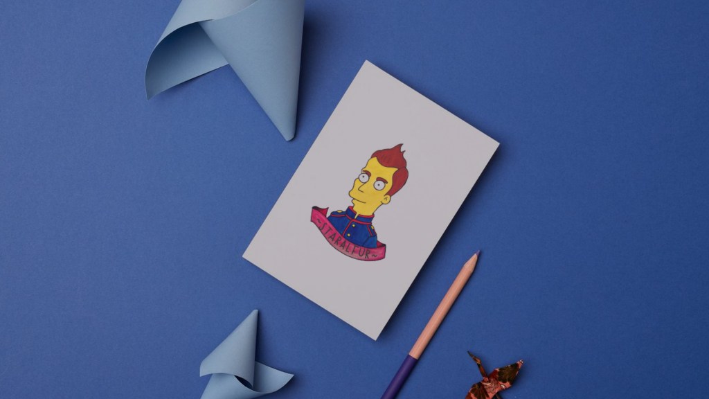
The banner reading “Staralfur” adds a slightly surreal and personal twist to the work. I like the way small text elements can shift the meaning of an image or invite the viewer to imagine a story behind it. It’s a small detail, but details like that are often what make a piece memorable.
When I work on pieces like this, I pay close attention to clarity and composition. I enjoy creating artwork that feels clean and graphic while still showing the care and patience that goes into the drawing process. Even when the subject feels lighthearted, the process itself remains thoughtful and intentional.
For me, each drawing becomes a moment of focused attention. It’s a chance to translate a simple idea into something visual, precise, and lasting.

Leave a Reply
You must be logged in to post a comment.